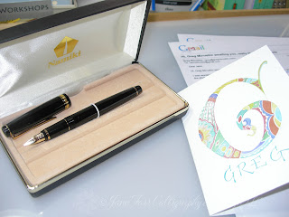
This is my new and improved Namiki Falcon fountain pen.
I had purchased the pen nearly two years ago, because I was intrigued with the idea of a fountain pen with a flexible nib. However, in the course of two years, I hadn't used the pen much at all. I had hoped it would yield a nice contrast between thick and thin strokes, but that wasn't the case for me. The above photo was taken before I had the nib modified. The image originally appeared in THIS POST.
After my initial blogpost about the pen, nibmeister Greg Minuskin contacted me about adding some flex and a needlepoint regrind to my pen. This past summer I decided to finally do it and prepared my Namiki Falcon for the flight to Greg.
I am very happy with Greg's work! His turnaround time was speedy quick. I am really pleased with the contrast between the thick and thin strokes.
I have been playing with the pen using Pilot Iroshizuku fountain pen ink. This yummy color is Sweet Persimmon Red. I purchased the ink at: JetPens
To visit Greg's site and learn more about his services, CLICK HERE.
Greg is married to talented calligrapher, Janet Takahashi. To visit Janet's site, CLICK HERE.
Thank you for visiting!
I appreciated all the kind comments and emails this past week. :)
Go forth and flourish, friends. :)


Honestly, Jane, you could letter beautifully with a sharp stick you found on the ground! But this in interesting and certainly worth a look for the rest of us! XOXO
ReplyDeleteOk, Jane. Thanks a lot, haha. You've made me want to purchase the pen and Greg's services. Wonderful work! The pen truly looks like an impressive tool now, and your finesse is the finishing touch! Love that persimmon ink too!
ReplyDeleteWhat is going on with the pic of "Thick Thin" in this post? "I am really pleased with the contrast between the thick and thin strokes."
ReplyDeleteIt looks to me like a flex nib that is NOT working properly! It is "Railroading" Big Time! Flow problems... Maybe it's the ink, but likely not.
Or more likely problems with the operator. I'm not in the habit of using a fountain pen. I was experimenting with how far I could spread the tines and still maintain a flow of ink. I found the tipping point. However, I am VERY pleased with Greg's work and my pen.
Deletewow.....what a difference! i think i have an entire drawer filled with pens that could use greg's magic touch! and i'm loving that persimmon ink....but then again, your letters look gorgeous in any color!! xox
ReplyDeleteHi, Jane, I love the instruction about pen regrinding. That is a great idea. And love your letters too, they look so pretty in that autumn color!
ReplyDelete