Showing posts with label iampeth. Show all posts

Sunday, March 9, 2014

Calligraphy Studio Overhaul

 Helloooo Friends! It's been over four months since my last post.  I've been keeping busy with a number of projects; one of which was giving my studio a much needed overhaul.  In the image above and video below, you can see how cluttered I had allowed my work space to become...

Ugh! I was beginning to suffocate.

 This image was taken during the long, overdue purge.  I tried to remove as many things as I could from the studio.

I am slowly and judiciously bringing items back into the studio. 

This is my main workspace. This image was taken during the purge, before I brought my light box back into the studio.

This is the same view now.

 Another view during the purge...

 ....And after.  My desk had been in another part of the house.  I'm happy it's now in my studio.

 My bookcase looks so anemic now.  I donated two, FULL suitcases of books and periodicals to my guild's White Elephant Sale.  My biggest challenge will be resisting the urge to buy more books.

I actually have room to practice some Carolingian!

My Mac Space. 

I updated my pen racks using burlap. :)

I apologize for not posting sooner.  I appreciate your concern and support, and I'll try to post more often. Although I'm rarely on Facebook, I think my blog posts will still link there automatically.  I have been sharing images on Instagram, and I link them to my Flickr account.  If you're on either of those two sites, then feel free to look me up by my username:  carmelscribe

Don't forget.....IAMPETH is coming to Indy this summer!! Convention registration for members begins this coming Saturday, March 15, 2014 at 11am Eastern Standard Time.  If you are an IAMPETH member, then you should have received an email recently requesting that you update your member information.  All IAMPETH members are asked to update their information via the new system as soon as possible.  (Whether you plan to attend the convention or not)

I hope to see you here in Indy this August!
xo
Jane

Friday, July 12, 2013

Calligraphy Flourish Friday - Celebrating 50


 I celebrated my 50th birthday this month, and since this is typically a slow week on the internet, I want to take a little time out to thank everyone for all the funny cards, beautifully hand lettered greetings, gifts, emails, texts, messages and phone calls.  The love and good wishes of family and friends made turning 50 a pleasure! (Well, excluding the above birthday greeting from the AARP. haha)


With the help of family and friends, my daughter surprised me with this video. I loved it!!!  If you're ever looking for a special gift for someone, then consider this great idea.  With smart phones, iPads,  Photo Booth on desktops,  etc., people are able to record and send video clips. Amazing! (Rachel used iMovie to compile the clips and arrange the video.)  Thank you, Rach! Thank you family and friends!

To celebrate my 50th with my readers, next Friday I will announce a giveaway.
Be sure to check back.
Until then, go forth and flourish!

....and for those of you at IAMPETH, I hope you're having a wonderful week.  Enjoy your last few days in Albuquerque!  I can't wait to see you at IAMPETH in 2014!
xo
Jane

Friday, June 7, 2013

Calligraphy Flourish Friday - Comparing G Nibs

I did a little G nib comparison sheet this morning. 

 Tom had a meeting in Nashville earlier this week, and I tagged along.  It was great to see Rachel (our daughter), my sister and her family, *AND* pay a visit to Paper and Ink Arts. PIA is a candy store for calligraphers, but it's not a traditional retail store front.  Jennifer Allen, the Director of PIA, was gracious enough to let Rachel and I prowl around....oops, I mean, "Rachel and *me*" ...the grammar police will get me....(aka Tom)    :)

Two things I wanted to try: the Tachikawa G nib and this palette of Fine Tec Pearl Colors. 

Thanks to Heather Held's recommendation several years ago, I already have (and LOVE) the Fine Tec gold palette.  The new palette also has 6 colors.  The new palette's wells are smaller, but it's also less expensive.

 I regularly use both the Nikko G and the Zebra G.  Sometimes the Zebra G is a little too sharp for me.  Although my hairlines tend to be finer with the Zebra G, they also skip more.  I was very interested to see how the Tachikawa G performed for me, and I am quite happy with it.  My hairlines aren't quite as fine as with the Zebra G, but I didn't have the skipping problem.  I love the colors of the new palette, especially the Shining Aquamarine.  As it flowed out of the pen, I was mesmerized!

Jennifer said she was going to have the Tachikawa G nibs available at both The Summit conference and at IAMPETH.  I also have some comic nibs from Kuretake, including a G nib, that I will blog about in the future.


You can find both the Tachikawa G nib (Item: TACHG) and the Fine Tec Pearl Colors (The Item# I used for this test: FN600S, price: $17.95) at Paper and Ink Arts website.

As usual, we had a great time in Nashville. Our hotel was hopping due to a country music awards show to be held the next day.  Tom and I had no clue who any of the people were though.  :)

Don't forget! Google Reader will be discontinued July 1st.  If you use Google Reader and want to keep receiving updates to A Place to Flourish, then please enter your email address in the designated box on the sidebar of my homepage.

Also, for those interested, my son has a new post regarding his research in the Australian rainforest: CLICK HERE.

Have a great weekend everyone.
Go forth and flourish!!
xo
Jane

Friday, March 22, 2013

Calligraphy Flourish Friday - IAMPETH

After seeing THIS POST I had done, Nan DeLuca asked me if I would do something similar for the 2012 IAMPETH Round Robin.  I miss Nan's presence. The online calligraphy community isn't quite the same without her.  I like to do this type of record keeping since I first learned it from Barb Close.  It helps me to remember things I've learned or seen that I would otherwise forget.  All the above elements were either learned at an IAMPETH class or seen in the archives. I like to make grids not only for flourishing elements but also for letters. It is amazing how many different variations you can have for a single letter.

Tomorrow, March 23, 2013 is registration day for IAMPETH members.  If you plan on going to Albuquerque for the convention this summer, then don't forget to register online!  It starts at 11am Mountain Time, which I believe is 1pm Eastern.

For 2013 IAMPETH Convention Information, CLICK HERE!

Even without the Boilers in it, I am having fun watching the NCAA Tournament.  I know some of you have already endured heartbreaking losses, and there have also been some big upsets.  My brackets are a mess!! haha.

Enjoy your weekend...Go forth and flourish!

Friday, August 31, 2012

Flourish Friday - IAMPETH Reflections: Free Your Hand with Pointed Pen with Barbara Calzolari


 My second day at IAMPETH was spent in Barbara Calzolari's "Free Your Hand with Pointed Pen" class.  It was another great day, as we once again filled pages and pages of practice lettering.
Beautiful Barbara teaching and sharing with the class. I think she is saying something cheeky about American fashion here. :)
 Barbara's work on screen. She is explaining how she releases the tines of the pen at the bottom of a stroke.  Barbara credits the amazing work of Mike Kecseg for inspiring her love of pointed pen variations.
Barbara's delicious work on screen.

Barbara sneaking in some pointed brush and explaining that much of what we are learning can also be accomplished with a pointed brush.

This magnificent "M" of Barbara's is right up my alley. I've enjoyed double stroking letters ever since - years ago - someone shared in a post on Cyberscribes about Martin Jackson's Six Techniques for Calligraphers. Double stroking a letter was one of the six techniques. (I just tried to find that post on Cyberscribes.  It was by Harvest Crittenden in 2005!!)

 Barbara told us a good exercise is to practice letters from very small to very large on lined paper. (Unfortunately, I brought the wrong paper to class, but it was still a good exercise on plain paper.)

 Above, I practiced "Freeing my Hand."

For "Love" I combined some of the double stroking on the "L" 

More in class practice - change of direction on the "G" descender.

I worked on a project this past week where the client had pretty much given me free reign on the design. (Love it when that happens!)  

I enjoyed including some of the things I learned in Barbara's class on the words: something's, about,  to, and take.  

 I also used the opportunity to practice on this past week's "thank you" notes to clients.


 I really enjoyed Barbara's class. We worked through the entire lower case alphabet before lunch and the entire upper case after lunch.  Barbara shared plenty of variations with her students.  Thank you, Barbara! I want to give a special shout-out of thanks to Kathryn Sanchez and Irene Martinez, for going to the office supply store and making copies of Barbara's in-class demonstration pages for their fellow classmates.
The best part of Barbara's class? Sitting next to the pretty, and pretty talented Jody Meese! Miss you, Jody!! (Sorry,  I probably didn't get this posted in time for your morning coffee. haha)

Thank you, all, for visiting.
Go forth and flourish!

Friday, August 10, 2012

Flourish Friday - IAMPETH Silent Auction


This is one of two pieces I am donating for the IAMPETH silent auction which will be held tonight at the convention.  (I am composing this Flourish Friday the night before I leave for Milwaukee, and it should post automatically while I'm away.) I hope to share all the wonders of the convention in the weeks and months ahead!

Have a terrific weekend.
Go forth and flourish!
xo

Friday, August 3, 2012

Flourish Friday - IAMPETH & The Power of Words


Today, I feel like a bee in a bonnet...a BB in a boxcar...a chicken with its head cut-off...what else? A pinball?  Anyway - a LOT to get done, including pack for the International Association of Master Penmen, Engrossers and Teachers of Handwriting convention.

I'm really looking forward to IAMPETH!
I know IAMPETH President, Debi Zeinert, and her diligent crew have put in countless hours preparing for this year's gathering in Milwaukee.
Will you be at IAMPETH? Not going, but wish you were? Please leave a comment on this post!

The image above is the result of one of my "bottom of the inkwell" playtimes.  When I get to the bottom of my inkwell, I will usually play in one of my journals or on a big sheet of paper as I did above. Then I tear the piece of paper into smaller sections.  See my previous "bottom of the inkwell" posts by clicking HERE, HERE and HERE.

I thought you might be interested in the following.  My thanks to Tootie Horn for sharing this information with me.  Tootie received the following directly from calligrapher Tina Lee-Cronkhite:

I and five other calligraphers have devoted 2 years to producing our piece for Artprize, the world’s largest art competition in Grand Rapids, MI. From September 19th–October 7th 2012, you can view the piece at the Women’s City Club. PLEASE pass this on to all your friends. We’d like as many people to view this as possible. This is a work of art that will survive centuries because of the nature of the materials we have used. Not only is it a love of letters, but the Calligraphic world has not seen anything like this before. Please take a moment to view these sites and then sign up to vote! (You can’t vote until September 19th and you must sign up in person after doing it online to be eligible to vote, rules at artprize.org)

Here’s our Facebook page: https://www.facebook.com/scribes.six

Please view The Power of Words by The Scribes Six.
( Marijo Carney, Kimberly Dixon, Jane Ewing, Tina Lee-Cronkhite, Christine Orsolini,  and Karen Vosburg) I had the pleasure of meeting Jane Ewing during the Chicago Calligraphy Collective's fieldtrip to Twinrocker, and I wish her and her fellow scribes the best of luck.

To view The Power of Words entry Click Here.

Have a great weekend!
I hope to see you Monday in Milwaukee!!!

Friday, December 9, 2011

Calligraphy Flourish Friday - Christmas Tree, Spencerian and a Beast

©Jane Farr Calligraphy & Design LLC

This is a flourished Christmas tree I did in Heather Held's The Artful Flourish class at IAMPETH this past summer. Speaking of Heather, have you seen the logo she designed for the 2012 IAMPETH Convention? It is absolutely gorgeous!!! Go see it by clicking HERE.


Do you want to learn Spencerian without leaving the comfort of your home? Now, you can! Harvest Crittenden and Michael Sull are working together to offer a Spencerian Online Correspondence Course consisting of 12 lessons. Please visit the "Classes" page of Harvest's website to read all about it.  Harvest and Michael have given a clear outline of the information to be covered and how the course will operate. To visit Harvest's website and read a brief overview about the class, click HERE.
To read a more detailed outline of the class or to register, click HERE.
Registration is now open.
I've already signed up, and I hope to see you in class come January!

....and one more thing....

My printer arrived!  Fortunately, I am blessed with good neighbors, because the FedEx driver delivered it to the wrong house! Unfortunately, my poor elderly neighbor about put her back out dragging this beast up onto her porch and into her home. (She thought maybe her son had used her address for a surprise Christmas gift for one of her grandchildren.) I am going to have to do some rearranging to make room for it, but I can't wait to try it.  Thanks again for all your suggestions and advice about printers; it was a great help to me! 

Happy Flourish Friday!!
xo
Jane


Friday, December 2, 2011

Calligraphy Flourish Friday - Linda Hirsh

©Jane Farr Calligraphy & Design LLC
Just before Thanksgiving, I was reading through Julie Wildman's November newsletter for the Chicago Calligraphy Collective.  I was stunned to read that Linda Hirsh, a calligrapher in San Diego, had a brain tumor and was in hospice care.  She was on my mind all through Thanksgiving, and I made a note to send her a card.  Unfortunately, I didn't get it done in time. I was so sad to learn of her passing earlier this week.
©Jane Farr Calligraphy & Design LLC
The first time I experienced Linda was at the Nashville IAMPETH. I took her "Copperplate Chic" class, and it was a blast! We just bounced from one fun thing to the next. I could just tell that Linda loved anything and everything to do with calligraphy. New techniques and creative ideas just seemed to ooze out of her. She had such flair!

©Jane Farr Calligraphy & Design LLC
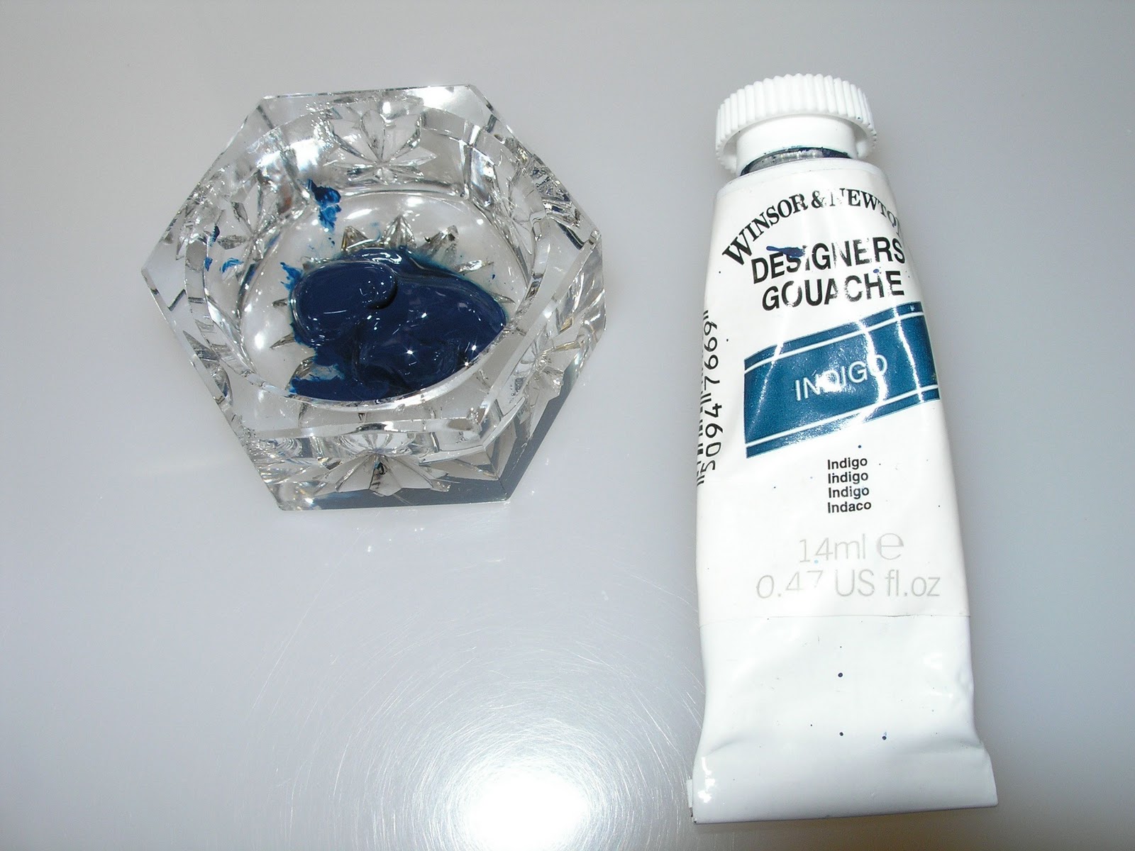
 One of the techniques she taught was writing with gouache and Schmincke powder.  Mix your gouache in a well (add a drop of gum arabic).
©Jane Farr Calligraphy & Design LLC
 The Schmincke powder is very fine, and Linda suggested covering the top with a piece of nylon (panty hose).  Sprinkle the powder on top of the gouache.  Then load your pen with a mixing brush. Do NOT mix the powder into the gouache, but just let it rest on top. Then... letter away! I used a Zebra G nib.

©Jane Farr Calligraphy & Design LLC
I sat in on Linda and Brenda Broadbent's "Something Adventurous" program at IAMPETH this past summer in Phoenix.  They were quite the comediennes. Again, Linda's enthusiasm just made me smile. She was such a great ambassador for the lettering arts.  I realize many of you knew Linda well, and I'm sure your lives are richer for having called her friend. 

Go forth and flourish!
xo

Friday, September 9, 2011

Flourish Friday - Calligraphy Practice

©Jane Farr Calligraphy & Design LLC

The first evening of the 2011 IAMPETH convention, we were treated to a viewing of the Horace Healey Collection.  (You can read more about the collection by clicking HERE.)  There was one particular alphabet that really caught my eye with its over-the-top but gorgeous flourishes.  I enjoy trying to figure out how these letters were constructed.  I spent some time yesterday playing with the letter M.  Not an easy thing.  I tried it on graph paper first, not the best paper... or was it the nib....or was it the ink?  After changing paper, then nib, then ink, then paper again, and then nib again... I figured it was Finger-Movement-Only-Death-Grip-Jane that was the problem. :)

 As it is, this M makes no sense if you want to have lower case letters following it, but I think the original is just so beautiful.  You should go see it. I hope the following link to The University of Scranton Special Collections works:


The photo should be filename: iampeth_02_089. I'm not very knowledgeable about identifying which penman did this. Does anyone know?  The University of Scranton's Zaner-Bloser Online collection is an incredible resource. The home page for the collection can be found by clicking HERE.

Wishing you a wonderful and reflective weekend!
xo
Jane
Friday, August 19, 2011

Calligraphy Monogram Design - Flourish Friday

©Jane Farr Calligraphy & Design LLC
 Happy Friday everyone! 
Another class I took at IAMPETH was Michael Sull's Monogram Design.  

©Jane Farr Calligraphy & Design LLC
Michael taught us to use tracing paper and different colored pencils when designing monograms.  For a personal monogram, he had us start with sketching the initial of the first name using one color of pencil.

©Jane Farr Calligraphy & Design LLC
  We then used a second piece of tracing paper, layering it on top of the first. Using a different colored pencil, we sketched the middle initial all the while trying not to get too much spaghetti going on in the design.

©Jane Farr Calligraphy & Design LLC
 We then layered a third piece of tracing paper over the first two in order to begin working on the last initial. (I only had two colored pencils with me.) :)

©Jane Farr Calligraphy & Design LLC
 I really like the F, but I wasn't thrilled with the spacing between the J and A.  I thought they were too close to each other.

©Jane Farr Calligraphy & Design LLC
This is a little better....hmmm...maybe too much spacing now. Also, I think the top of my J needs to be higher.   What kind of wacko would want to spend hours playing around with 3 letters?!! umm... ME!! :)

©Jane Farr Calligraphy & Design LLC
At home, I practiced with pen and ink. I used a Zebra G nib and McCaffrey's black ink.  I practiced at various sizes. Let me tell you, it's much easier with a pencil - for me at least.  I really enjoyed the class.  Michael also taught us how to do family monograms. In a family monogram, the initial of the last name is in the center and is usually a bit larger than the first initials of the wife and husband. Traditionally, the wife's initial goes to the left of the last name initial and the husband's goes to the right.

Thank you all for your kind and caring comments and private emails last week. It is nice to know I wasn't the only one that was feeling overwhelmed.  I also appreciate the good advice many of you shared with me. You're a real blessing in my life.  The lettering community is a pretty special group of folks!   I hope you enjoy your weekend!!
((Big Hugs))
Jane
Related Posts with Thumbnails