Friday, March 11, 2011

Calligraphy Flourish Friday- The Antique Page with Harvest Crittenden

©Jane Farr Calligraphy & Design LLC
The Calligraphy Guild of Indiana was fortunate to have Harvest Crittenden in town this past weekend for Harvest's "The Antique Page" workshop.  This piece above is a work in progress.   
When I am done, it is going to look like......
©Harvest Crittenden  - Acorn Arts
This!! 
(Well....maybe....with any luck, it will sort of look like this.) 
This is Harvest's sample piece. It is even more gorgeous in person.

©Harvest Crittenden  - Acorn Arts
Speaking of gorgeous in person, this is Harvest. She is an amazing artist, calligrapher, engrosser and Master Penman.  She was inducted as a Master Penman at the 2010 International Association of Master Penmen, Engrossers and Teachers of Handwriting (IAMPETH) convention in Orlando. Including Harvest, there are only 10 Master Penmen within the IAMPETH membership. 

©Jane Farr Calligraphy & Design LLC
In the photo above, Harvest is showing us beautiful examples of her antiqued papers and is explaining how she accomplished each of them.  We can't wait to get started!

Illuminated "J" by Harvest Crittenden
As an added bonus, Harvest demonstrated how to gild with Instacoll and patent gold. The paper was "antiqued" with a coffee stain.

©Jane Farr Calligraphy & Design LLC
Here are a few of my antiqued papers. We tried a variety of Harvest's secret recipes, each resulting in a different look.  This page was done with a combination of the raspberry, peach and walnut stains.
©Jane Farr Calligraphy & Design LLC
This page was done with the green stain, a bit of coffee staining and some tissue napkin collage.

©Jane Farr Calligraphy & Design LLC
The workshop was a blast! A giant, messy play date!  I look forward to aging these pages even further by adding some lettering and photo transfers.

Harvest Crittenden and Jane Farr
Harvest is a great instructor. She is very well prepared and thorough. Visit her website to see all her spectacular work and to see the other workshops she teaches. (Click here) She will be doing workshops for guilds in Los Angeles and Minneapolis in the very near future.  Harvest will be co-teaching the Spencerian Saga with Michael Sull this year.  She will also be teaching at the 2011 IAMPETH convention this summer in Phoenix.  Registration for the IAMPETH convention is now open for members. Have you registered?!  I have!!!  Registration will soon be open for non-members.  Spots are filling up. For more info, click here. Please let me know if you'll be there.  I'd love to meet you!

My Google Reader is bursting at the seams. I apologize for not being able to visit all my friends in blogland. Wedding season is in full swing for us calligraphers!  I hope to pay you a visit today and see what you've been up to lately.

Have a great and flourishy weekend!
It's March Madness!!!!!!
xo
Jane

Friday, March 4, 2011

Calligraphy Flourish Friday - Moleskine, Ruling Pen, Congressional Chorus & Hebrews 12:2

©Jane Farr Calligraphy & Design LLC
Playing fast and loose in my Moleskine with a ruling pen, Moon Palace sumi, Japanese lace paper, and Derwent Inktense pencils.  Every now and again I simply enjoy slinging some ink and not worrying about the end result.
The Congressional Chorus Advertisement
Last fall I was contacted by an illustrator, Greg, requesting permission to use one of my marbled paper images on Flickr.  He had seen some prints I had made in a Diane Maurer-Mathison workshop.  Greg does the illustration for The Congressional Chorus in Washington D.C.  Didn't he create a terrific illustration for the campaign? (I wish I owned a pair of those shoes!)
Greg's other campaigns for The Congressional Chorus can be seen by clicking here and here.
Greg, thanks for sending me the finished results. I appreciate your thoughtfulness!

©Jane Farr Calligraphy & Design LLC
Above is my original paper. I think this is the image Greg used. He did such a great job making it pretty in pink that I'm not certain if it was this image or another one in my Flickr Photostream.

The Congressional Chorus Advertisement
If you will be in Washington D.C. March 25 -27, then put on your marbled dancin' shoes and join The Congressional Chorus at the Atlas Performing Arts Center.  It looks as though it will a swingin' good time! For ticket information, click here.

©Jane Farr Calligraphy & Design LLC
I had been curious about Dr. Martin's Pen White, so I bought a bottle.  I used it straight from the bottle - no diluting with water.  So far, I really like it. 

©Jane Farr Calligraphy & Design LLC
I love Gwen Weaver's pointed pen lettering which inspired the larger letters in this piece. (Sorry, it appears Gwen's website no longer exists.)  I used the Dr. Martin's Pen White and a Spencerian No.1 nib.

I hope you have a great weekend.
I know I will - I'm taking Harvest Crittenden's Antique Page workshop.
Woohoo!! :)


Friday, February 25, 2011

Calligraphy Flourish Friday - Mandala and Bible Verses


©Jane Farr Calligraphy & Design LLC
I made a few cards this week. The above mandala was done with Moon Palace Sumi and a Zebra G. I wanted to add some corner flourishes. I'm not in love with these corners, but there are parts I'm in like with. :)  More practice and refinement is needed.


For the Psalm 23:4 card I used gouache, a flat brush, and a Hiro 700 nib. I went back over parts of the flower with the same color gouache mixed with Peal Ex powder.  It still need something, so I added some touches of Dr. Martin's Bleedproof White to the center of the flower.


 I am trying to be more disciplined about lettering bible verses.  During my quiet time, I'm always jotting down scripture references which I intend to letter "someday."  For this week at least, I actually followed through on a couple.  Both Isaiah 54:10 and Hebrews 6:19 were done with Moon Palace Sumi and a Zebra G comic nib.
***Update:  If you are interested in prints of any of my work, please contact me. You can find my email above on the right. Thank you! Unless otherwise noted, all work on this site is ©Jane Farr Calligraphy & Design LLC. All Rights Reserved.***
Thank you all for your continued support of A Place to Flourish.
I appreciate your comments and emails.  I enjoy my wedding calligraphy business very much, but your support spurs me on to include other types of lettering in my daily life.

Enjoy your weekend!
xo
Jane

Friday, February 18, 2011

Flourish Friday - A Fun Book and Macy's Follow-up

©Jane Farr Calligraphy & Design LLC
This is a little booklet I made for a friend using sweet Jan Kruger's instructions.

©Jane Farr Calligraphy & Design LLC

It's a really cool structure, and thanks to Jan's great instructions, not difficult to make at all.
I did make my cover top a little bigger than the directions.
©Jane Farr Calligraphy & Design LLC
I did some pointed pen lettering on some of the panels.
You can find Jan's directions for this "Flat Panel Book" in a pdf by clicking here.
Visit Jan's blog by clicking here.
Thanks Jan! I loved making this book. :)
©Jane Farr Calligraphy & Design LLC
As I mentioned last week, I did some on-site calligraphy for Macy's (a department store) on Valentine's Day.  For any customer that purchased a Heart of Haiti pendant, I would personalize the inside of the card with calligraphy.  It was for a great cause, and I had a wonderful time. Thanks to Peggy and Nancy of Macy's for making it such a great experience!  See the Heart of Haiti pendants by clicking here.

Wishing you a terrific weekend! It is a beautiful day here in Indy!!


Friday, February 11, 2011

Calligraphy Flourish for Valentine's Day

©Jane Farr Calligraphy & Design LLC

Wishing you a Happy and Flourishy Valentine's Day!
For this heart, and the one below, I did the original penwork with Moon Palace Sumi and a Zebra G comic nib. I then scanned it and played with it in Photoshop.  After months of computer troubles, I finally relented and bought a new computer.  I now have full blown Photoshop. I had been using my old version of Photoshop Elements. You don't know how relieved I am to still remember how to do the few things I learned in my Photoshop Elements class from last year. phew!!!!
©Jane Farr Calligraphy & Design LLC
Have a great weekend! As I type this the temperature is still in the single digits, but at least it is sunny!
On Monday from noon to 2pm, I will be doing some on-site calligraphy work for Macy's at the Castleton Square Mall location in Indy (fine jewelry department) as part of their Heart of Haiti project.  
Read and watch more about Macy's Heart of Haiti project by clicking here.
Maybe I will see you this Valentine's Day at Macy's!


Friday, February 4, 2011

Flourish Friday - Mail Art Across the World 2011

©Jane Farr Calligraphy & Design LLC
I have finished and mailed my envelopes for the 2011 edition of Mail Art Across the World (MAAW).
I encourage everyone to participate!! Although I did an envelope for each of the four addresses, you don't have to do it that way.  You can make and send just one or as many as you choose.  The above envelope was done with a 3.8mm Pilot Parallel Pen filled with Higgins Eternal for the broad pen work and a Zebra G comic nib with Moon Palace Sumi for the pointed pen.  Bill Lilly showed me the beauty of going back in broad letters with a pointed pen.  I used a Brause 515 and Dr. Martin's Bleedproof White to do that on the capitals. I love the look of it and want to do the alphabet from A to Z.  Fiona's A Letter A Week group is inspiring me!

©Jane Farr Calligraphy & Design LLC
I used both manufactured and handmade envelopes. Above is a page I did at Victoria Pittman's Tortured Metals workshop. (More about that workshop here.)
©Jane Farr Calligraphy & Design LLC
This page is from a previous Flourish Friday post. (See it here.)
I like using an envelope template.  I bought these inexpensive templates years ago from www.greensneakers.com.  (I think the company has since gone out-of-business, but they may be available elsewhere.) Of course, you can easily make your own template by deconstructing and flattening an existing envelope. I like a template with a window, because it helps me identify areas that would be good for addressing.
©Jane Farr Calligraphy & Design LLC
This is an old practice page. I washed over it with water to move the existing lettering to the background. I didn't want the background to overpower the address.
©Jane Farr Calligraphy & Design LLC
For this envelope, I did the address on a sheet of translucent paper using Moon Palace Sumi and a Hiro 700 nib. I had to add a second, plain piece of the translucent paper underneath, because the background lettering was competing with the address. This stitching technique was inspired by a card Barbara Calzolari sent to me. 
©Jane Farr Calligraphy & Design LLC
I used a ruling pen and FW Acrylic Artist's ink for this envelope. I went back in with gel pens and a hot foil pen on the capitals. I like using postage stamps from my old collection. 
©Jane Farr Calligraphy & Design LLC
For this envelope, I used a combination of Neuland and Gwen Weaver's Romancing the Roman.
I used the same FW acrylic and a Speedball C-0 for the Neuland and a Hunt 22 for the pointed lettering.
©Jane Farr Calligraphy & Design LLC
The Mail Art Across the World deadline is April 1st.
Join the fun! For details click the link below:
If you decide to participate, I'd love to hear from and see your submission!

Thank you everyone for your thoughtful words and prayers, both here and privately, this past week.
Tom,  his family, and I took great comfort knowing you were lifting us up.
(((Big Hugs!)))
Wishing you a flourishy weekend - even if that means ice skating in your front yard!

Friday, January 28, 2011

Calligraphy Flourish Friday - Sue

©Jane Farr Calligraphy & Design LLC
Regarding last week's post. Yes. Of course, you're right -  creating Valentines in January is rather proactive. As those readers who have followed A Place to Flourish for any length of time realize, writing and grammar are not my strong suit.  What I was trying to say was that I procrastinate getting things loaded into my Etsy shop. I still have a handful of Valentines to load into my shop.  It's the process of taking photos, uploading them, writing descriptions, etc. that I put off.  I can usually find something else to do. :)

©Jane Farr Calligraphy & Design LLC
This past week has been a difficult one. Tom's sister, Sue, died very unexpectedly.  We soldiered our way through the arrangements and the funeral in Ohio, but now that we are back home, the sadness is really starting to sink in.  I was thinking of her last night, and decided to letter her name. I used a 6 Automatic Pen and walnut ink.  A big drip hit the paper, and as I lifted the paper to wipe up the mess underneath, the "e" ran.  I guess it's like a teardrop and rather fitting. I went back in with gold gouache and a Hunt 22 for the flourishes on the "S".

Once I get caught up on my workload, I look forward to seeing what all my friends in Blogland have been up to.  I know that will lift my spirits!! :)

Happy weekend Dear Friends!

Friday, January 21, 2011

Calligraphy Valentine Cards - Flourish Friday

©Jane Farr Calligraphy & Design LLC
 Here are some images of flourished Valentines I did recently to list in my Etsy Shop...my exceedingly anemic Etsy shop.  If I actually produced every piece I think of creating to put in my shop, then I would have a very, robust shop! :)
©Jane Farr Calligraphy & Design LLC
 I don't have all the Valentine pieces listed yet, because I am the Queen of Procrastination.  Actually, I have been the Queen of the Land of Wedding Invitation Envelopes.  January use to be a slow time, when I could play and try new things, but I am happy to have the work.
©Jane Farr Calligraphy & Design LLC
 I used a Hunt 22 Nib and Schmincke Red Pearl gouache.
©Jane Farr Calligraphy & Design LLC
I enjoyed creating these and making each one a little different.
©Jane Farr Calligraphy & Design LLC
Unfortunately, you can't really tell how beautiful the Red Pearl gouache is from these images.
©Jane Farr Calligraphy & Design LLC
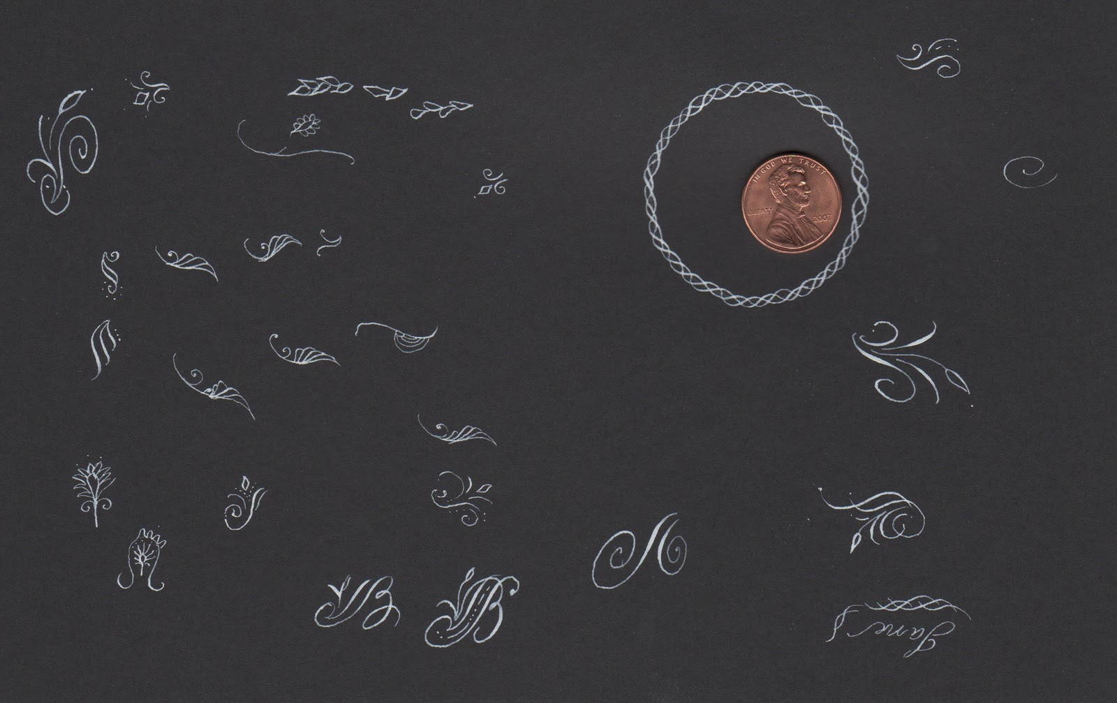
I have been practicing working very small. I've also been trying to lighten my touch in order to get super, thin hairlines.
©Jane Farr Calligraphy & Design LLC
For my practice, I used a Brause 515 and Dr. Martin's Bleedproof White.
Back to the lightboard!
Have a great and flourishy weekend everyone!

Friday, January 14, 2011

Flourish Friday: Namiki Falcon Fountain Pen

©Jane Farr Calligraphy & Design LLC

Tempted by the video on this post at the blog of GreaseMonkeyHands, I purchased a flexible point Pilot/Namiki Falcon Fountain Pen. I don't know anything about fountain pens, but I was really intrigued by the subtle thicks and thins achieved by the pen on the video. 
©Jane Farr Calligraphy & Design LLC
My pen arrived today!!

©Jane Farr Calligraphy & Design LLC
 With the assistance of GreaseMonkeyHands, I also bought appropriate ink for the pen.
©Jane Farr Calligraphy & Design LLC
 Here is a front and back view of the nib.
©Jane Farr Calligraphy & Design LLC
 To fill the pen, I dipped the entire nib into the ink.
As you can tell by the ink on my hands, I'm a rookie at this!
©Jane Farr Calligraphy & Design LLC
Then I twisted the little, black end piece clockwise to bring the ink into the cartridge.

©Jane Farr Calligraphy & Design LLC
I have a lot of practicing to do in order to get the hang of it!
Mine doesn't seem to be as flexible as the one in the video, but maybe it needs to break in a bit. 
(or maybe it's operator error!)
I think this pen will be great for letter writing.
I've really enjoyed playing with it today.

Put a little flourish in your Friday!

Related Posts with Thumbnails