Wednesday, April 29, 2009

Dimensional Calligraphy with Sharon Hanse

My calligraphy guild, CGI, just held a wonderful, two day workshop with Sharon Hanse.  It was titled "Dimensional Calligraphy."  We learned to make stencils and cutouts from our lettering and artwork.  Here is my cutout.  Sharon had us rough out our lettering on tracing paper first. Then once we had our design, we cut it out of Bristol Board.  I will definitely be on the prowl for a soft grip Exacto knife with my next 40% off coupon!  I placed my cutout on various backgrounds.  You can see more on my Flickr page, but I love this background.  It was made by Sandy Wagner.  I think it's FABULOUS, and it's in my colors too.  I thought about sticking it in my bag, but I'm pretty sure she would have missed it.

Another project Sharon had us complete was an embossing of our lettering on a piece of copper.  (Chillax is a blend of "chill out" and "relax.")  I discovered the wider the letterforms the better.  I got too thin in a few places.  I added the handle and beads at home.  I want to find a little hanger for it, so I can put it on the back deck. (Since that's where we do most of our chillaxing in the summer.)


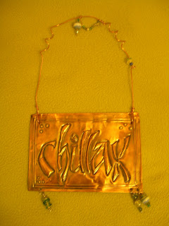
The thing I liked the most was creating a stencil of our lettering.  Additionally, Sharon had us save and mount the "drop out" pieces onto drafting vellum.   This way, using a light table, I'll be able to emboss and deboss the letters on the same piece of paper.  It will give the illusion that some letters are in front of the others.  I haven't had time to play with it yet, but I'm looking forward to doing it.  I'll also be able to use the stencil for pastels, chalk, etc.

Using the stencil from above, I did a blind embossing on a piece of Canson Mi-Teintes.  I plan on lettering Proverbs 3:5-6 on it, which is one of my favorite verses from the Bible.

It was a great workshop, and you can see more photos from the workshop here.  Please check back on Friday for this week's flourish!

Friday, April 24, 2009

Flourish Friday


Flourish Friday
Originally uploaded by carmelscribe

Well, this Friday's flourish is a testimony as to why I shouldn't pick up the pen immediately after returning from Starbucks! You can see in the bottom, left corner the wonderful lettering of George Bickham. This is from page 6 of The Universal Penman. I used FW Acrylic "Prussian Blue" ink. Not so great in this nib, which is a "Spencerian #48." Just a month or so ago, I found a little box of various nibs in the secretary desk we inherited from my husband's grandparents over 10 years ago!

Caffeine, acrylic ink, stiff nib, not using full arm movement -- all elements for the perfect storm of average flourishing. I hope next week will be better....

Thursday, April 23, 2009

Calligraphy for Ronald McDonald House

I volunteer my calligraphy services to the Ronald McDonald House of Indiana.  They present plaques to different organizations that are successful in collecting 1 million or more pop can tabs for the House.  Represented in this batch of plaques is 41 Million pop tabs!  The RMH of Indiana is a special place with an inspiring history.  One family's struggle has become a blessing for thousands upon thousands.  I hope you'll take time to read about it here

Check back tomorrow for Flourish Friday!

Friday, April 17, 2009

Flourish Friday

Here are 3 flourishes for your viewing pleasure. Each one is a detail shot taken from my Quaker Wedding Certificate shown in yesterday's post.  I learned to make the top and bottom flourishes--or cartouches really--from Pat Blair.  Pat is the head calligrapher at the White House, and she is an incredible calligrapher and a very, nice lady. 

I based the flourish below on one I saw in The Universal Penman.  I love that book!  It is chock-full of beautiful, pointed pen examples.

The mica watercolors really sparkle and shine.  I had to continually mix the color, but it flowed well from the pen and yielded good thicks and thins.

Check back next Friday for another flourish!

Wednesday, April 15, 2009

Quaker Wedding Certificate

I have been working on wedding envelopes for clients all week, so I haven't had time to experiment with other projects.  Here is a sample calligraphy project I finished a few weeks ago.  It is a Quaker Wedding Certificate, or at least it's loosely based on the Quaker tradition.

I really liked working with the mica watercolors.  They are sparkly!  I got the "Vintage" set from Brenda at Paper and Ink.  You can find the set here.  The Copperplate majuscule O has always been rather boring to me, so I am always looking to expand my O repertoire.  I like the O I used on this certificate.


I used my own wedding information for the sample.  I made our names a little larger, in a different color, and in a more formal style - but I still don't think there is enough contrast.  Next time, I would do the names larger and in a different color - maybe rust instead of the gold.

I have a couple of larger, commemorative wedding pieces to do for clients in the coming weeks, and this was good practice.  I hope you're able to click on the photos to make them larger.  I am still struggling with adding images to my posts.  Hopefully you can click on the title of this post, and it will take you to more photos of this sample Quaker wedding certificate over at Flickr.
Check back tomorrow for a closer look at the flourishes!

Friday, April 10, 2009

Good Friday Calligraphy Flourish

Since this is A Place to Flourish, I thought I would start posting a calligraphy flourish each Friday. Here is a flourish for Good Friday. 


Thursday, April 9, 2009

The Book of Jane

I have finished binding my three books for the Cyberscribes' calligraphy book exchange! The calligraphy on the covers was inspired by the terrific lettering of Mark Brooks.

The Book of Jane
If you would like to see more photos, you can see them in my "The Book of Jane" set at Flickr. Poor Sheba.  I ran out of room and time, but she knows she's the treasured baby of the family.  Here's a little peak at my makeshift book cradle!

P4080026

Thursday, April 2, 2009

Calligraphy Book Exchange

The deadline for the calligraphy book exchange I'm participating in is fast approaching. Yikes! Here are a few of my pages.  This page is a comment on growing up as a Hoosier. (Although I am definitely NOT an I.U. fan!)  Our Japanese exchange student was most impressed by all the basketball goals he saw.  It's true.  Basketball is a big part of Indiana culture.  Evidently, Titivillus was sitting on my shoulder, because I see I accidentally lettered "and" twice in one spot....oops!


cards 086

Our books are to be autobiographical, so these next few pages are about my family.  I toyed around with Claudine Hellmuth's Poppet style, which is great fun.

cards 087

I usually have mad love for Arches Text Wove, but this sheet has been a beast.  Maybe it's because I added walnut ink and crumpled it up first, but the calligraphy has been a battle.  My nibs have been picking up fibers with every stroke....grrr!...but, my daughter Rach sure is cute!

cards 088

I like the style of lettering I did on Matt's page.  I just made it up.  I like the Legende typeface for its long ascenders and descenders, and I had that in mind as I was working.

cards 089

Hmmm....maybe I should do a page for our sweet, little dog, Sheba!


Related Posts with Thumbnails